Thursday, 12 February 2015

Album Review; Girl by Pharrell Williams


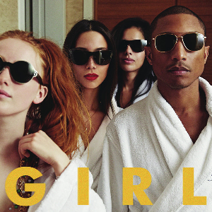
Girl (stylized as G I R L) is the second studio album by American recording artist and record producer Pharrell Williams. The album was released on March 3, 2014, through Williams' label i Am Other and Columbia Records.Girl is Williams' first studio album in eight years, following his 2006 debut, In My Mind. The album contains appearances by Justin Timberlake, Miley Cyrus, Daft Punk and Alicia Keys. The album received generally positive reviews from music critics. It peaked at number one in 12 countries worldwide, also charting in the top 10 of 17 other countries. 

The album has sold 519,521 copies in the United States as of September 17, 2014. The album's lead single is the Academy Award-nominated song "Happy" (from the Despicable Me 2 soundtrack), which is a huge worldwide success, selling more than 10 million copies worldwide. Further singles "Marilyn Monroe", "Come Get It Bae" and "Gust of Wind" have achieved moderate success. At the 57th Grammy Awards, the album is nominated for Album of the Year and Best Urban Contemporary Album. The track Happy was nominated for Best Pop Solo Performance and Best Music Video.


First thing first the text; now we can see it is very basic and but what we notice is the significance of the colour; which is evidently yellow. Now at first sight that may just be over looked but if we look at the music video in which we are studying which is Happy we can notice that one of the main themes of the video are the minions again which are link to despicable me in which the song was the main sound track for the popular film "Despicable Me." The minions are one of the definitive features in both the movie and then again in the music video but this is to promote the film. Now we can start to see the relevance of the colour yellow in relation to the the text on Album cover.

Another aspect of the CD that we have to read into is the lavish lifestyle, as we can see from the robes they are wearing. Robes are often associated with the higher/upper class which has the connotations of wealth and that of lavish lifestyle. Picture it like this; if you go to a 5 star hotel they usually equip the room with special pillows made out of real feather and although that is all well and good for a souvenir that is not really realistic to take it. however things like luxury flannels and other sorts of items we don't see around again like robes is easily fitted in suitcase. so going back to Cd Covers it is meant to symbolise the wealth and lavish lifestyle Mr Williams lives.

To conclude the CD Cover has many themes and ideas embedded for the audience to read into for example it is a direct mode of address to the audience, however ion the other hand in the same light it is not as the audience cannot see their eyes. This has connotations of robots androids programmed to do what they are told. This CD is a depiction of what Mr Willams' Fans and what they are all probably trying to achieve and as demonstrated in happy it is about the feel good vibe that you get from the album cover as well as the music video.

Sunday, 1 February 2015

Music Video Review; All about that Bass by Meghan Trainor


Meghan Trainor is an upcoming artist but her new song “All about the bass” will surely ring bells. The pastel ridden video is a catchy soon I already at No.2 in the charts. Surprisingly Meghan is not a teen herself and interestingly has been in the music business for a while in 2011 she had an album titled Ill sing with you. Through first impression it seems that just like the bass guitar in a song is like its thickness Trainor related the body to that but before you start judging her you’ll realise the video is actual quite empowering.

The clothes used in this video adheres to the stereotypical conventions of a pop music video as the artist along with the other performers in this video are wearing clothes that are considered fashionable/stylish and even mainstream so to speak. However this is song is walking on thin ice because on one end of the scale she is giving of a positive vibe but on the other end there are cracks because even though she is portraying a positive message its not as straight forward as it seems.

First of all the song at a glimpse is overall has the right intention but are they executed in the best way? Through lyrics like “'Cause I got that boom boom that all the boys chase/and all the right junk in all the right places” it seems that Trainor still looks male approval. Critics are not impressed; “Loving yourself because dudes like what you’ve got going on is a pretty flimsy form of self-acceptance,” writes Feministing. But that is not to say that has ever stopped us from loving catchy pop songs before now has it? However the song still might be a good entry point for many women to realize that the standards they are held to are unrealistic.


"Yeah, it's pretty clear, I ain't no size two/ But I can shake it, shake it, like I'm supposed to do..." are the first lines of consequence in the song, so right off you know it's an anthem to empowerment and a call for positive body image.
"If you got beauty, beauty, just raise 'em up/ 'Cause every inch of you is perfect, from the bottom to the top,.." she continues. The choice is yours, as Black Sheep once sang. You can either become a victim of a negative vicious cycle or use that to empower yourself so it all depends as an individual to determine where you come on that scale. Now we can look at colour symbolism. Colour symbolism is highly culture-specific and variable. It is clear that in most of Europe and America in the 19th century and early 20th century, pastel colours were considered "youthful" and were used more often to flatter the complexion, not denote gender. 


Pink was considered more flattering for brown-eyed, brown-haired people and blue for blue-eyed people. When pink or blue were used in gendered ways, it seemed to be a matter of fashion -- a temporary trend -- not a tradition. Nor were they used consistently the way we do today (pink=girl, blue=boy). First, pink became so strongly associated with femininity, that when a boy or man wears it is is no longer "just a color", but an act of defiance or personal expression beyond the aesthetic. Second, it eventually crowded out other colors in the options for babies and little girls. Finally, pink has been adopted by manufacturers of thousands of products as a way to differentiate their wares and sell more items, especially for children.

So there it is. Before 1900, pink and blue were two of a range of pastels appropriate for babies and children, symbolic of gender to the same extent that shamrocks symbolized luck -- in a light-hearted, fanciful way, not a moral imperative. From 1900 to around 1940, their modern associations were taking shape, but were often reversed in some parts of the United States, and still not taken too seriously. From around 1940 until the mid-1980s, pink and blue had their now-familiar associations, with regional exceptions and lots of other options. Since around 1985, pink has been not only a strong symbol of femininity, but neutral and non-pink options have been gradually edged out.First, pink became so strongly associated with femininity, that when a boy or man wears it is is no longer "just a colour", but an act of defiance or personal expression beyond the aesthetic. Second, it eventually crowded out other colours in the options for babies and little girls. Finally, pink has been adopted by manufacturers of thousands of products as a way to differentiate their wares and sell more items, especially for children. 


So there it is. Before 1900, pink and blue were two of a range of pastels appropriate for babies and children, symbolic of gender to the same extent that shamrocks symbolized luck -- in a light-hearted, fanciful way, not a moral imperative. Since around 1985, pink has been not only a strong symbol of femininity, but neutral and non-pink options have been gradually edged out.

Music Video Review; Don't by Ed Sheeran


Don’t” is Sheeran’s newest video, and it follows dancer Phillip “Pacman” Chbeeb as he works his way from sweatpants to suits, dancing his way to the top.  The video does not reflect the song, as the song is about Sheeran’s resentful feelings towards a woman who cheated.  It does, however, beautifully depict the evolution of Chbeeb’s dancing career. Sheeran makes a drive-by appearance (literally, he drives by when Chbeeb is dancing on the sidewalk), and his face appears subtly throughout the video, such as on the TV screen in the first house.  Overall, the music video focuses on Chbeeb’s story and his incredible dancing but the song focuses on issue in Sheeran's personal life.
Sheeran's drive-by appearance in "Don't"The video Don't by Ed Sheeran, directed by Emil Nava's visual screen play for Ed’s latest X single follows a talented dancer as he strangely contorts, bends and twists his way from rags to riches, going door to door and messing with hearts along the way. As for Ed? He’s here too, briefly, in a drive-by cameo, but the attention is mostly on a series of strangers. The narrative could be interpreted in a number of ways (as evidenced by the on-going discussions in the video’s comment section), but it all seems to connect back to some of Sheeran’s more popular song themes — fame, fortune and broken relationships. But wait, perhaps even more obvious; I guess the impact of Sia‘s mesmerizingly strange “Chandelier” video is now clearly being felt within the industry. Rather than to feature a well-built actor wearing a white tank top Sheeran chooses to reflect the musician’s own dishevelled aesthetic, having said that he does make a couple of cameo appearances in the video.

Album Review: Take Care by Drake


Take Care is the second studio album by Canadian recording artist Drake, released November 15, 2011, on Aspire Music Group, Young Money Entertainment, Cash Money Records and Republic Records. It is the follow-up to his 2010 debut album Thank Me Later. Production for the album took place during 2010 to 2011 and was handled by, Boi-1da, T-Minus, Just Blaze, The Weeknd, and Jamie xx, among others. With the album, Drake sought to record a more cohesive recording than his debut album, which he felt was rushed in its development.

Background information taken from; https://en.wikipedia.org/wiki/Take_Care_(album)

The Album cover reflects the songs on his album, they are are all so slow songs that make you think about life and where you stand in it. He talks about everything from love all the way to relationships. His album cover sees him sitting at what looks like an old fashioned library which more than often had old antique painting as seen above. For a a modern artist we can see that this is not the usual album covers that contemporary artists usually use. This is a common theme with this artist, he likes to take general conventions and twists them slightly.

Music Video Review: Happy By Pharrell


Happy is of a pop genre and the video is typically follows the basic conventions of a pop genre the artists and in this case other “performers” in this video are dressed in what I would call fashionable or stylish attire it can be also said that they are dressed in the mainstream outfits. Evidently portrayed by both the title of the song and the vibes coming from the video (pardon the pun) the video is a generally “happy” video and the characters seem to be enjoying themselves and generally seem more than content with life. In concern of the lyrics they are based on the loving nature of society rather than love in terms relationships. However in this video there is not a specific audience because of the nature of the song and its lyrics the message to the song can be applied to all ages whether it be children to teens or even adults as portrayed by the wide variety of the appearances by representatives of all the age groups there is a sense of unity in which is portrayed becomes it’s not age specific and neither is it gender specific.


What Color Communicates https://blogger.googleusercontent.com/img/b/R29vZ2xl/AVvXsEiCPDWGSIww4wRJZ_jXOPL5lcQlaRkoNp_t71g_r3_G6mnuVcWuMGNJFOlveCZZYsN2LiT-ijJUktbNbsE4blVRoO5tyFvJSAc7b304SP4Y1RxnR2ttsD5eZeck_5VggOQqxzuQuGSllGU/s1600/color-communication-guide.pngThrough the clothing used we can see that here is a positive vibe coming off as there are mainly bright colours used in this video there are blues yellows pinks and so on there are no colours that promote violence because even when there was red attire it was a very light red as opposed to a dark blood red. Colour symbolism is important in this video and there is a lot of it for example just looking at Pharrell if we take a closer look at the colours he is wearing there is a lot of bright colours for example he wears a lot of white in the video in the opening seen he is seen to be wearing white and white symbolises innocence, purity and simplicity and like the nature of the video portrays a very relaxed vibe. Then we have green and although it is a mild green jumper green represents life and growth hence why we can see all the different spectrums of life from children to adults. It represents the environment and can explain why there are many different locations seen in the video and finally it represents healing and through the lyrics we can see the healing nature of the song. The exuberance that is associated with the song and the feel good nature it has. Throughout the video we see Pharrell wearing black and most of the time it s to promote brands but black also represents elegance and power which is something that ties in well with the theme of the video. Black is not always a negative colour but that's not a conventional theme for pop videos so we have a little deterrence form the pop genre as usually its strictly bright colours.
Happy is a performance based video which means rather than telling at story we have a performance but in this case the term "performance" can be used loosely because its not like using actual performance rather than an many cameos from both famous and ordinary people showing the audience that you it doesn't matter whether you have celebrity status or not happiness is something that we can all have. throughout the vide we have people dancing walking and even riding bikes, in this case I do not think its scripted the performer just can and try to portray happiness the way they see it fit. The structure of the song is very simple and so its meaning because if you think about the line "room without a room" means there are no limits. A roofless room has no boundaries and there are not limits allowing your happiness to fly to unimaginable heights. It is unfortunate to think that some people do not know what makes them happy and the line "clap along if you know what happiness means you" is just meant to make you happy through the happy feel good song that it is.

In the video the only shots we really see are long shots and this is for a number of reasons. First of all in the video the performers are either dancing or walking or interpreting their vision of happiness in some shape or form so using close shots would not demonstrate and show what they are doing effectively. There are a few medium shots but these are very rare but it is his video so these shots are usually promoting a brand of clothing; or to show of his signature hat.  The editing is effective because it usually follows the beat of the song so it is in sync with the video. The shot only change when the is a change in the beat of the song. In terms of lip syncing the characters on really do this when it is the chorus or on one of the more popular lines and that's it but obviously Pharrell lip syncs the verses and then on the chorus its usually other people.