Friday, 24 April 2015

4. How did you use new media technologies in the construction andresearch, planning and evaluation stages?

Microsoft packages 


For a lot our planning we used Microsoft word as well as microsoft PowerPoint. We used them to plan both our pitch for our music video. We were able to plan our props and costumes and ensure that we had everything we needed in place before we started. They say that planning is essential which I can confront is true. Compared to my AS production where I didn't plan as much. It would explain why I didn't really know what I was doing and when.  So thanks to PowerPoint we could plan props, market research and use it as a platform to prepare for our music video. 

Photoshop


For our Digi-Pack we used Photoshop to edit our poster as well as our CD Cover as it is cutting edge editing software that is on a professional level and it would be best suited to edit our Digi-pack. I am very familiar with the software so it was easy to manipulated the image. I was fully aware of the all the tools and filters and special; effects that you can use. Adobe Photoshop is not for the for the faint hearted and because I have experience from both AS and A2 photography. 

Camera

The school provided us with a canon video camera to use which for the price was okay. It was alright if you wanted to do some tests shot but when it came down to our actual video it didn't have the quality that we needed. So in the end we decided to use an iPhone 6 camera as it was able to film in HD. The only thing is that when we put into youtube, it was resized so we lost the quality through the importing and exporting through different software like Final Cut and iMovie. 

Youtube

Youtube was also an effective tool and a vital one at that for many reasons. First of all it served as a platform to for videos to be shared and watched and gives small artists the chance to get themselves out there and for them to be recognised. There are also many tutorials for different things so if at any point you are editing and you wanted to use some sort of effects but you didn't know which one to use then you could go onto youtube and you will most likely found some sort of tutorial showing you which tutorials other people have used and how to do it. It gives you the opportunity to expand you mind and you can go onto youtube for help. For example as I was planning for our music video at certain point we would get stuck for ideas and we would use youtube as a tool to help up get the inspiration we needed. 

iMovie
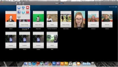


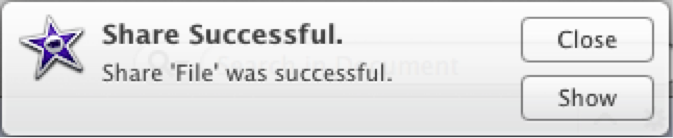
Our video was edited in more than one platform; the first platform was Apple’s own; iMovie.  As the only person editing our film I found that iMovie looked a lot simpler to use but when I tried to move clip from iMovie to final cut I found this process very difficult and this was because the iMovie that was made available to me was a newer version than to the one I used in AS media. Usually on the older version once you clicked ‘export’ you could easily move clips from iMovie to final cut. However on the newer version you had to click ‘share’ and then it would act as if it was trying to export the file but it would come up with a shortcut saying failed to export and this happened not once but many times.it worked once and thats was how we were able to get the green screen images onto our actual video.  Last year for my AS production I worked on my own and I did not use Apple's iMovie for the exact same reason, I found it too difficult to use as the layout is not clear and I found it had more capabilities than Final Cut. However it was useful when it came to the green screen as we were able to add the urban background to the clip and it let us export it to final cut so in that sense it was  useful for that reason. 

Final Cut
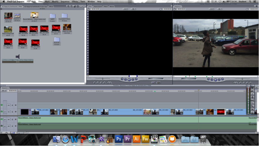

The main programme that was used to edit our video was Final Cut Express. I was used to the programme and so editing in it was a breeze. To edit you would first have to import you clips onto your computer and  then extract import them into final cut. There was no loading time for this process but to put them from the Final Cut Express library to the editing ay you had to wait for it to render. Also whenever you made any change whether it was a big change or minor one  you needed to wait for it to render. Now at the start of the AS course I didn't know how the rendering process worked so i just did it all at the end and waited how ever long it took to do so (most times this took a while).  

However at the start of A2 I figured out that if you made sure that your clips did not lap each other you could move them without having to render them. Little things like that saved me a lot of time and effort. Now other things that would happen that would hinder progress was your video files weren't saved properly the above error message will come up and you would not be able to use the clips so you
had to very careful. If you wanted to get into causal editing then I think that is a great programme to start with as you can use basic skills and as long as they sort out the layout it would be best suited to the everyday user.


Thursday, 23 April 2015

3. What have you learned from your Audience feedback?

 
This is our questionnaire we made before starting to filming. We wanted to make sure that even before we started filming. We needed to make sure that we get audience feedback before we filmed so that we know what the audience will be looking for when they watch our video. We found that a lot of our questionnaires have a similar theme. Whether they are young or not, male or female we found that most people listen to music whether they listen to t on a daily basis or no hey still listen to music. So this meant hat if we created a music video that was not to specific and that everyone can relate to then we would surely have a hit.


Here is a video of our audience feedback.
 
I also sent our music out via email and here are some of the responses we got ;
 
To the left we have one of my friends who fall in our 24+ category and as we can see she liked the music video and felt that it was a feel good song that all ages can get used to. It is always relevant and the meaning of he song is innocent, here are no references to sex or relationships so young children an listen to it over and over again and they will still retain their innocence so she feels it will always be remembered.
 
What we can take from this audience feed back is that hey enjoyed the music video as a whole but thy felt that it was up to scratch with the fact that nowadays with the recent developments in technology she felt that because our video was not HD even though it did not detract from the video she feels as if that was a minor setback.  However as were only creating the video own our own with he help of our school for equipment we didn't have the  necessary equipment to make an HD video. But that was the only negative comment we received from our target audience and it wasn't anything major.

 The second person I asked was from the 12 to 15 group and as you can see she gave the perspective view from a teenage opinion, she thought it was really good. She mentioned the green screen and that that was her favourite part as well which is a relief because during the editing process I was unsure and very reluctant to say the least of whether to put the bit we did on the green screen because I personally felt like it was the only bit in our film that didn't go well with the rest of our video.

2. How effective is the combination of your main product anancillarytexts?


I think that the combination of our main product an ancillary texts go together very well because they both have themes that complement each other very well. We have used themes that interlink with each other. For example the brick work; we used our first location as a basis of our CD. In our video you see James Gomez in a location of which we used for our CD Cover which adheres to conventions which state that artists usually use Images taken from their video. As we see to the left popular artist Taylor swift has taken an image from one of her music video and put it on her CD cover, this is so that when the audience see her video they can automatically see a link between the video and the CD cover. It adheres to the fact that music genre is normally conveyed through the video dressing and setting. This is why an resist Digital Pack must have similar connection to their music video. Audience love when are able to see a link between the artist and their work. Our CD cover also has a subtle link to James Gomez' persona, he grew up in an urban environment so we though by having the brick background then it would act as a subtle link to his biography and were he has come from.

Mise-en-scene was very important to us we wanted to make sure that we follow most of the typical conventions of pop music. Pop artist usually wear very colourful and trendy clothing and we have done this but at the same time we have slightly twisted the meaning of trendy. We have taken from Pharrell's very distinct fashion taste; something in we which to make present with our artist James Gomez. We wanted him to be easily identifiable to the everyday audience regardless of the age. We wanted Gomez to be identifiable as soon as the audience see a James Gomez poster. We want him to be a child's idol so to the kids they see him as a role model but to the adult they see him as a gentle man. 


For the poster we wanted to make sure that we continue the theme only this time rather than making subtle hints we would make a direct link to Mr Gomez' background and his home town of Brooklyn. This is why we used his home town of Brooklyn and we wanted to portray a more positive side to Brooklyn subtly as there are a lot of negative association with the town and we wanted to almost inspire to show that it doesn't mater where you come from, if you have the motivation to succeed you will. This is not something that a lot of people will pick up instantly as an upcoming artist will not have that fan base that will look to deeply into his history. Later on in his career it will become more apparent and that is when he can appeal to those kids and teens who are in the same situation that he was.
 
In terms of colour scheme we made sure that our poster has one main colour and kept it neutral. The colour blue was the basis of our poster as the colour blue considered beneficial to the mind and body. It slows human metabolism and produces a calming effect. Blue is strongly associated with tranquillity and calmness. Blue is used to symbolize piety and sincerity. So we made sure the sky was a beautiful looking blue colour with the sunset peeking through. The suit that I wore as James Gomez was also blue. So there is a subtle link in the colours and the meaning behind them.

Wednesday, 22 April 2015

1. In what way does your media product use, develop or challenge forms and conventions of real products?

Genre Conventions


Our poster has similar conventions of a promotional poster. We have a picture in the background that represents the artist background we have the name of the main track on the album which is Happy. Where our poster differs from Pharrell's is that we included extra details like whether it is out or not and where you can get it, as seen by the HMV logo at the bottom of the poster. We also have the website so that when potential fan sees the poster they can easily log on to his website and find out more information. We have kept our production simple and the themes current.

Pop artist are usually considered 'fashionable' or 'trendy' and they are usually seen wearing clothes that are mainstream. In our video we have taken some of this on board and made sure that our outfits are trendy and relatable to a mass majority whether young or old. Our main outfit was a dark blue suit with a wine shirt without a tie. We felt that if we had a tie it would be too formal which is not he type of vibe we were looking for. We wanted to make sure that when our audience watches our video they are uplifted by the feel good nature of the song.

One of a the main conventions of a pop video is for the artist to be conveyed as a happy person who is living lift to the fullest and content with life. I played our artist James Gomez and because of my nature this was very easy and it came natural to me. Portraying my own personality through the artist James Gomez it was easy for me as it was like having a alter ego but I did not have to act any different to how I act normally I was able to enjoy it. I have a very bubbly personality and I am the type person who does not stress, I am a very easy going person and that is exactly how we portrayed Mr Gomez.

Another convention that is typical of pop genre is that music videos are mostly about love and relationships. This is something that our video that does not adhere to. Our video has one theme and that is only to be Happy (pardon the pun) and to enjoy life. Which is not usually what pop videos are usually about; they are about love not necessarily sex but love, heart break and emotions.  We thought that if we picked a song that followed this convention it would put a damper on the mood and that's not the vibe we wanted to create. We wanted to create a feel good video for all ages.

Our video has proven successful in my opinion as we did our market research and we found out what the audience would be looking for in a pop music video we went away and we created a feel good video for all ages. We adhered to most conventions, we kept the video up beat and the clips match this vibe. We have used very lively locations as well some f which show wealth and some of which show everyday live and everyday living something that our audience can relate to. In terms of our ancillary text we also followed themes of existing themes as we thought that if we tried to subvert or change those themes it would be difficult to get the recognition that James Gomez needs as a upcoming artist.

Final Product


This our Final Product
 

Tuesday, 21 April 2015

Out-Takes and Bloop


Throughout our fiming there were times were we would film and then end up not using the clips for one reason. Maybe I (as James Gomez) would forget a lyric or sing the wrong one.  So there were many clips we were unable to use. 


This clip was not used because of the fact that even though it was shot from a high angle it just did not look right when we put it into Final Cut Pro we found that the angle was too high. 


This clip here was going pretty good until a car drove past and Bukky lost concentration so she forgot were she was meant to be going. We were meant to have a wave in and out effect of the pillars of which we were going to film but this one went wrong because the camera was in the wrong place.


This clip wasn't used because there were these stones in the background and what we were truing to do is see if I could jump from one stone to the other whilst lip-syncing but as you can see it was a lot harder than we thought.

Filming Day 1


This was my Video Blog for the first day of filming

Filming Day 2


This is my Video Blog of our second day filming.

Monday, 20 April 2015

Digi-Pack


This is our Album cover we made entitled "Happy" by James Gomez. The album cover featured Mr Gomez on a brick background. Out of all the backgrounds we could have chosen we used a bricks because we thought it would bring a subtle urban flare to the cover. It was also a subtle link back to his urban background. We made this a recurring theme during our digital pack. In our Biography for James Gomez we mentioned his upbringing and mentioned that he had made a few song; only one of which was released. "My town" has been included in his biography as his claim to fame before he released Happy. The album was endorsed and produced by School boy records so we had to put the school boy logo to show this.
 
 
The poster was our main focus as we though that this would also help promote our artist. As an artist posters are essential to market themselves. As an artist James Gomez would need an effective way to get themselves out there. They need that boost that cements themselves into the music industry.
 
 
We kept the lyric sheet plain because we felt that it wont keep the audiences attention. The sheets are just for the audience to follow the song so personally I felt it is even better that we kept simple.  In Heinz site I think that maybe it wasn't the best idea to have a brick background. Maybe we should have lowered the opacity to make the lyrics the centre of attention and make sure that it is easily read. The inlay is also quite simple but because as a group we wanted the audience to focus on the front cover so we kept it simple enough see it nd appreciate it and then go back and focus on the front cover.


Filming Locations

We have many locations in mind for our video which are demonstrated in the screen shots below;


Our first destination is a located relatively local; The Chatham Marine. we thought this would be a good location because it offers the chance for scenic shots of a beautiful marine background. What this means is that there is the opportunity to have a few establishing shots panning across the marine. It is a good location and luckily it is not really far. So the plan is  to get a few shots here that we can open the video with where we will have the main character open the music video.


1st Location


As a group we decide to use this location as it is unusual and we like how it looked through the camera. We felt like this was one of Chatham Dockside's highlights and just an over good aesthetically pleasing to the eye. So this was the place we used as one of the opening scenes in our video. Unlike last year when I worked on my own I felt that it was easy to choose better locations because I was working in a group, it was all easy because there were many people so I could get opinions from more than one person. This location was used as the establishing shot for the video as it is scenic and is contemporary not usually seen in the everyday video.

2nd Location


This was our second location in which we used, the reason being is that we thought that the view from the marina would be not only a suitable location but like the first location it would be aesthetically pleasing to the eye. We felt that the it would be a good location to have as a background because of the clear view as well as the clear water and the boats and yachts that were docked. We felt that would show the wealth of our artist to live in such a high maintenance area.

Props


As part of our video we plan to have Morphsuits in the video as well just to be different. In the Original video Pharrell Williams has Minion costumes from the popular Movie in which the music video was endorsed. So in our video we are going to have the Morph Suit for a similar effect. The Morphsuit was going to be green and we are were going to have people changing into different clothes so it would give the illusion that the clothes were dancing without a body. it was meant to add to the feel good nature of the video.

However when we wanted to put it into full effect we decided that we would leave it out because we were having problems without our uploading and we thought if we filmed it and were unable to load it it would just be a waste of time to we poured our effect into the dancing on a a green screen in some sort of urban background to coincide with James Gomes' background.

Editing Research

When Editing my video I wanted to see if there were effects that I could use to make it look a little more edgy. I did some research and found that some videos use effects to enhance but I realised that it would have to be an effect that I could use constantly throughout the video or else it would look overcomplicated if I tried to do to many things at one time.


The video below was not a tutorial of how to add different effects but rather a show of different effects that you can add. There are various types which include;


Green and Red Overdrive - The Green and Red overdrive feature allows the clip to have an edgy feel to the frame. It looks like the clip has been submerged onto fire while an earthquake takes place. I think in the right type of clip it could be really effective but it has a serious aurora to the effect and for this reason I do not think it will fit into our video. 


Various YUV Adjustments w/Markers - These filters again are quite intriguing. The problem is that this filter does not go with the mood I am trying to create. I am trying to create a feel good vibe and as much as this filter creates certain mood like a rage and emotion with colours like with reds and oranges etc. Even if I used the blues and the green which create less intense feel it would not work. 

Green Screen

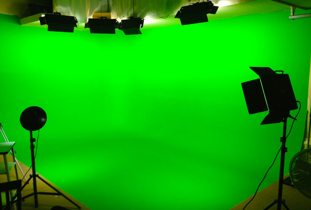
The green screen is an important part of the special effects and the process is known as chromakey. Chromakey allows television producers and movie makers to use advanced technology to superimpose their subjects onto an unlimited number of different virtual backgrounds. We plan to use this effect to make our video different and to make sure that our video is not a carbon copy of the original video. The plan was to have someone dress in green and just have the clothes showing on the green screen.

We also plan to use the green screen as we thought that this would allow us to be a little bit more creative. We have a plan to have someone dancing in a green morph suit to give the illusion that it is only the body moving. This will ensure originality from my video compared to the original by Pharrrel Williams. 


In our original plan we said that we were going to use the green screen to have someone in a green Morphsuit spit would give the illusion that there are clothes dancing on their own without a body. However due to complications we had to change our original plans so that we were not straying from our story board.

Digital Pack Preporations

For our digital pack we use the balloons from our filming and we lined then in a position using very bright coloured balloons to ehance the feel good nature we were trying to create in our music video. We wanted to reflect the positive vibes from our video in our "digi" pack hence why we used fluorescent ballons and in a cloud like position on a plain background to with a hand holding all five ballon each equipped with a letter from the word "happy".

However when editing the videos we came across a pose in which we could use. The reason we choose this picture is because we are going to use the image and have ballons edited in the side in that blank space reading happy. Although the previous  image was ideal we had trouble editing and we thought it would be a good idea to use a picture taken from the actual music video. So the audience will be able to recognise it. 

When we got to Chatham Marine Dockside there was so many different locations to choose from. In the end we choose the picture above because of the composition and the space that was on the left hand side because we felt that that as well as the posture of "James Gomez"makes him look confident and a establishes himself as a rising artist.


Thursday, 26 March 2015

Problems and Solutions

Now nothing ever done goes to plan and I say this because there were many problems we came into contact with. The first problem was that when we drafted our first music video it didn't really promote our music video or the artist James Gomez. Like the original we thought that it would be a good idea to just have people dancing in the background without it being a problem. However it looked more like a montage rather than a music video. Luckily we had time to alter this before the deadline.

Another problem we came across was the fact that not all our video footage was the same quality so we had to film a few of our scenes again. We felt as a group that we could do so much better and because of the fact that we were pressed for time a few of the other group members were a bit hesitant to do so but after we discussed it we agreed it was the best thing for us to do. It took some time and it was enough time to from the beginning.


Wednesday, 18 March 2015

Storyboard


The first scene on our story boss shows our opening transition. We were going to have the letters "h.a.p.p.y" flying across the screen in a swipe like transition. This background was going to be plain black and our letters were going to be yellow to fit in with the theme of the original artist and black and yellow are contrasting colours so we thought they would go together well. The next shot was to have (myself) James Gomez come out of the sheltered area at dockside signing the opening lyrics.


We thought that we could use the green screen to have the illusion that someone was in a hot air balloon. This was done so we could fit this clip in with the lyric "Hot air ballon, I could go to space." We found that in Pharrell's original he had actions matching to what he was doing in the video so hence why thought we would use this idea and add our own spin to it. We were then going to have loads of people dancing looking like they were having a good time as after all it is meant to be a feel good video.


We were then going to have the various shots of people dancing and we also going to have myself and other dancing dancing at various points to different parts of the song at different areas of The Chatham Dockside Marina as it is a very scenic ovation so this would be nice frames to have. 


Other frames we were going to include possibly if we had time were lots of different shots in the chorus of people dancing, different types of shots close ups medium and long shot to have a range. We were also going to have other people in a line with the letters "H.A.P.P.Y" in different colours and then repeat some of the shots until the video ends.

Monday, 2 March 2015

Questionnaires

Every video has to have a target audience, so this is something that all artists have to do. What is the point of making a children's video and then try and market it to adults, they would not be interested in it and they would not be able to relate to it either; this is why finding out your target audience is so important. Before we started with our video we wanted to do find out who our target audience is and once we established that it is for all ages young or old we want do a questionnaire to find out more about our target audience. 


As we can see the above questionnaire represents the adolescent population. The above group like Hip-Hop the most out of all the different genres out there. They represent the type of people who only very rarely listen to music and spend a maximum of 2 hours listen to music and they say that having a good music video will help the track sell. 


The above questionnaire represents the teenage population, it also represents the population that prefer Pop music the most. It represent the group that are casual music listeners who listen to a maximum of 5 hours of music in a week. These are just you're average music fans that only listen every now and then, this population also think that having a good music video helps promote not only the song but the artist.


This questionnaire represents the adolescent. It also represents the population that are into Pop music and those who listen to music more than the minority. These group of people also think that s good music video is essential to promoting the artist. What we have gained from these questionnaires is that it doesn't matter what age you are, regardless of whether you are male or female, most people listen to music and at some point whether on the radio or on television you will hear pop music at some point and all of those we asked told us that it is essential to have a video that promotes the artist as they are more likely to remember the video and that means they will talk about it and thats how the artist will eventually get the recognition they deserve. This is why we need our video to be recognisable and catchy.

Letter to the Record Company


We wrote to Columbia Records to ask for their permission to use happy for our music video. We had to this because of copyright and infringement issues as we did our research and some of the videos on youtube that have done covers of songs have stated "I do not own this video" or "No copyright infringement intended" and as our video was for education purposes we as a group felt that it was only right to do the same and put it in an informal letter stating our intentions.

Sunday, 1 March 2015

Character Profile

James Gomez


Born and raised in Brooklyn, 21 year old James Gomez was scouted whilst busking on the streets of his hometown and signed a record deal with label School Boy Records. James has always had humble beginnings, living with his grandparents up till the age of 18 as his parents couldn't care for him. 


'My gran and gramps did everything they could for me but I still didn't have all the fancy stuff the other kids had, music was my only escape'. James began learning to play guitar after starting middle school and soon realized his passion for music through a combination of playing the guitar and song writing. 

His first gig was at a local jazz bar not too far from his home aged just 15, where he performed one of his earliest written songs 'My Town'.Now James has found fame with hit 'Happy' the sky is the limit for this new star.

Gomez feels that with the help of music he can help restore peace starting with his home town of Brooklyn. With the help of his youth initiative 'Vibez' he can use music to get the upcoming youth of today off the streets and using that energy to learn new instruments and new skills.

Thursday, 12 February 2015

Album Review; Girl by Pharrell Williams


Girl (stylized as G I R L) is the second studio album by American recording artist and record producer Pharrell Williams. The album was released on March 3, 2014, through Williams' label i Am Other and Columbia Records.Girl is Williams' first studio album in eight years, following his 2006 debut, In My Mind. The album contains appearances by Justin Timberlake, Miley Cyrus, Daft Punk and Alicia Keys. The album received generally positive reviews from music critics. It peaked at number one in 12 countries worldwide, also charting in the top 10 of 17 other countries. 

The album has sold 519,521 copies in the United States as of September 17, 2014. The album's lead single is the Academy Award-nominated song "Happy" (from the Despicable Me 2 soundtrack), which is a huge worldwide success, selling more than 10 million copies worldwide. Further singles "Marilyn Monroe", "Come Get It Bae" and "Gust of Wind" have achieved moderate success. At the 57th Grammy Awards, the album is nominated for Album of the Year and Best Urban Contemporary Album. The track Happy was nominated for Best Pop Solo Performance and Best Music Video.


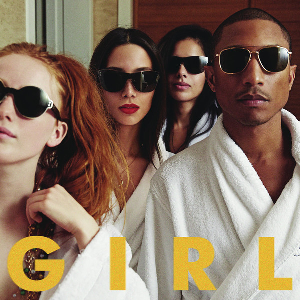
First thing first the text; now we can see it is very basic and but what we notice is the significance of the colour; which is evidently yellow. Now at first sight that may just be over looked but if we look at the music video in which we are studying which is Happy we can notice that one of the main themes of the video are the minions again which are link to despicable me in which the song was the main sound track for the popular film "Despicable Me." The minions are one of the definitive features in both the movie and then again in the music video but this is to promote the film. Now we can start to see the relevance of the colour yellow in relation to the the text on Album cover.

Another aspect of the CD that we have to read into is the lavish lifestyle, as we can see from the robes they are wearing. Robes are often associated with the higher/upper class which has the connotations of wealth and that of lavish lifestyle. Picture it like this; if you go to a 5 star hotel they usually equip the room with special pillows made out of real feather and although that is all well and good for a souvenir that is not really realistic to take it. however things like luxury flannels and other sorts of items we don't see around again like robes is easily fitted in suitcase. so going back to Cd Covers it is meant to symbolise the wealth and lavish lifestyle Mr Williams lives.

To conclude the CD Cover has many themes and ideas embedded for the audience to read into for example it is a direct mode of address to the audience, however ion the other hand in the same light it is not as the audience cannot see their eyes. This has connotations of robots androids programmed to do what they are told. This CD is a depiction of what Mr Willams' Fans and what they are all probably trying to achieve and as demonstrated in happy it is about the feel good vibe that you get from the album cover as well as the music video.